SP Services
Uni Project – Second Year (4th Semester) – Group project (Group of 5)
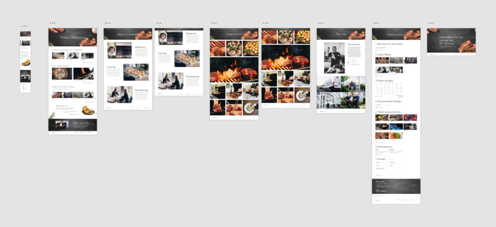
New user interface for a catering firm that needed a fresh and modern website that shows everything they have to offer in a playful and „handmade“ look.
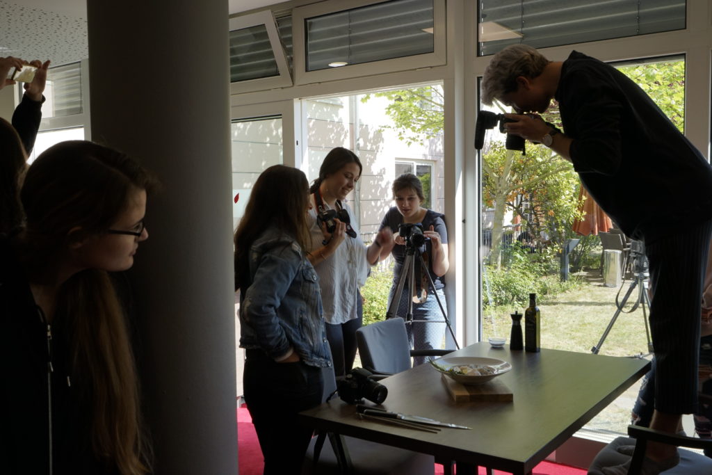
Behind the scenes
To get all the imagery we drove to Koblenz, where SP Services is located. Every group took pictures and captured moments on video for the website and the short image film we had to create. I took most of the pictures seen on the website and shot some scenes for the film as well.
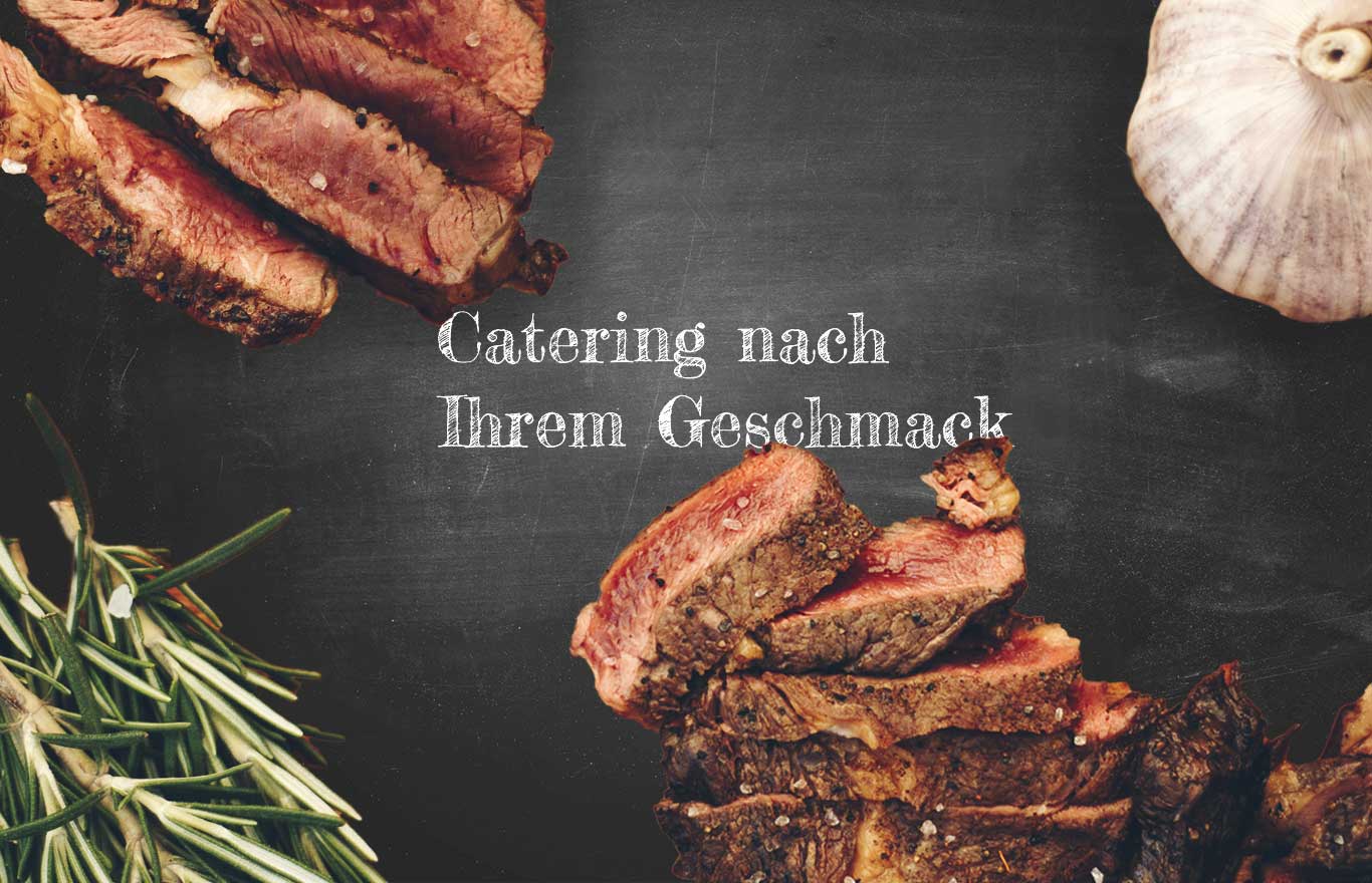
CONCEPT
Our goal for SP Services was to really emphasize a handmade look and feel throughout the website. The briefing told us that they do everything by hand and that the way they interact with customers is very personal. We did a lot of research and decided to use a blackboard and a font similar to chalk to provide a personal touch.
Implementation
Our key visuals are the icons and arrows that have a hand drawn look to them, which again, implements the handmade look and feel. We really wanted to incorporate actual food to the website, which is why we cut out some herbs, pans and other things that are used to prepare a meal in the kitchen.
what i’ve contributed to this project:
- Most of the conceptual work for the website along with another group member.
- I shot most of the pictures shown on the website along with other students from the other group.
- Header
- Services („Leistungen“) page
- Impressions („Impressionen“) page
- Thank you for your order („Vielen Dank…“) page
- About us („Über uns“) page